A fierce competition occurs every day in front of your store: the battle for attention. The average person sees up to 5,000 ads per day and each one is vying for mind-share. In this clash, the simple existence of your store isn’t enough. You need displays that make passers-by turn their heads in your direction. Here are seven suggestions.
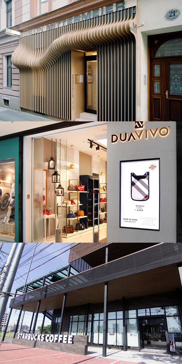
1. FLAUNT YOUR BRAND PERSONALITY
Because of the hundreds of stimuli while walking, the man on the street ignores bland, character-less things, including an indistinct store. To make people take notice, the store needs to show its personality. Use colors, lighting, and design on your storefront to represent your characteristics, whether it’s trendy or dignified.
Because of the hundreds of stimuli while walking, the man on the street ignores bland, character-less things, including an indistinct store. To make people take notice, the store needs to show its personality. Use colors, lighting, and design on your storefront to represent your characteristics, whether it’s trendy or dignified.
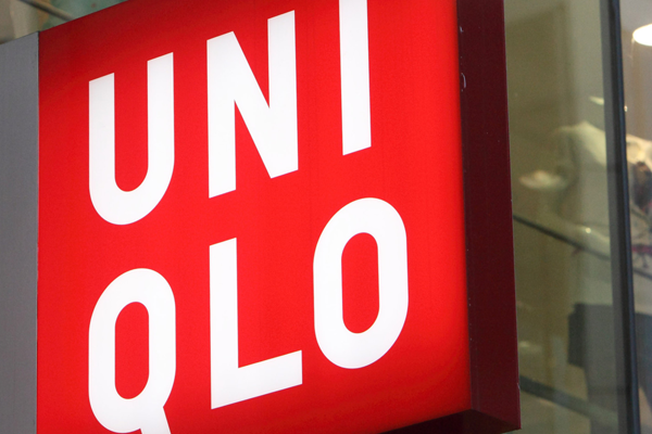
2. BUILD A MONUMENT SIGN
To grab people’s attention, a store needs to start from a distance. There should be recognition of your brand from at least 20 to 100 meters away. A monumental sign is a big help in this regard.
To grab people’s attention, a store needs to start from a distance. There should be recognition of your brand from at least 20 to 100 meters away. A monumental sign is a big help in this regard.
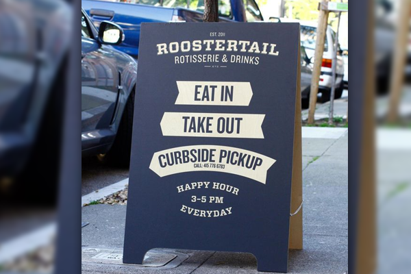
3. INSTALL A PORTABLE SIGN
If a monument sign isn’t possible, a portable one set in front of your doors can be a great alternative! These signs are also easy to replace; use them to inform passers-by of your newest bargain or latest offering.
If a monument sign isn’t possible, a portable one set in front of your doors can be a great alternative! These signs are also easy to replace; use them to inform passers-by of your newest bargain or latest offering.
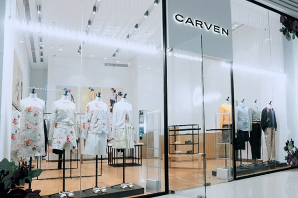
4. GET CREATIVE WITH YOUR WINDOW DISPLAY
When people are five to 20 meters away, finer details start to become visible. At this point, the store’s façade become’s all important. Greet them with a stunning window display. Great window displays fit the season, such as beach themes in the summer and Christmas motifs when the “-ber” months start the countdown. Use the display to convey a specific message to attract your target customers.
When people are five to 20 meters away, finer details start to become visible. At this point, the store’s façade become’s all important. Greet them with a stunning window display. Great window displays fit the season, such as beach themes in the summer and Christmas motifs when the “-ber” months start the countdown. Use the display to convey a specific message to attract your target customers.
5. FILL YOUR STORE’S VERTICAL SPACE
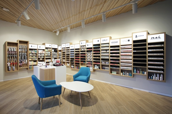
Within five meters, eye-level branding is critical. To dominate what people see, fill your store with your products from floor to ceiling. Build tall custom shelves that show off your brand and products. This tactic is effective even if the floor space is small. In fact, it’s a godsend for small shops because it increases display room and makes the space feel fuller.
Within five meters, eye-level branding is critical. To dominate what people see, fill your store with your products from floor to ceiling. Build tall custom shelves that show off your brand and products. This tactic is effective even if the floor space is small. In fact, it’s a godsend for small shops because it increases display room and makes the space feel fuller.
6. ADD DISPLAYS TO THE ENDS OF YOUR AISLES
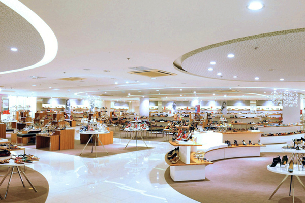
If your outlet is spacious enough for aisles, don’t make them too long. Uninterrupted shelves are easily passed by the eye. Open spaces in-between and add a display of related products. This is also an excellent place to feature items.
If your outlet is spacious enough for aisles, don’t make them too long. Uninterrupted shelves are easily passed by the eye. Open spaces in-between and add a display of related products. This is also an excellent place to feature items.
7. USE MULTI-SENSORY DISPLAYS
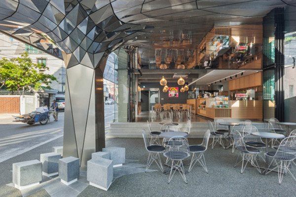
Did you know that humans have four types of light receptors but over a thousand types of smell receptors? People have five senses and it’s crucial to take advantage of them all. Open your doors to let the smell waft outside or the sounds of music. Multi-sensory displays, such as kiosks with speakers, have been used to great effect.
Did you know that humans have four types of light receptors but over a thousand types of smell receptors? People have five senses and it’s crucial to take advantage of them all. Open your doors to let the smell waft outside or the sounds of music. Multi-sensory displays, such as kiosks with speakers, have been used to great effect.
Encouraging people to your store is a challenge but with dazzling displays, it becomes a walk in the park.
Want more tips to improve your retail store? Contact Outboxd Design Team!
Source of photos: Homedit, Retail Design Blog, Philippine Primer, Retail News Asia, and MINE™.
